15 Jan PANTONE COLOUR OF THE YEAR 2020
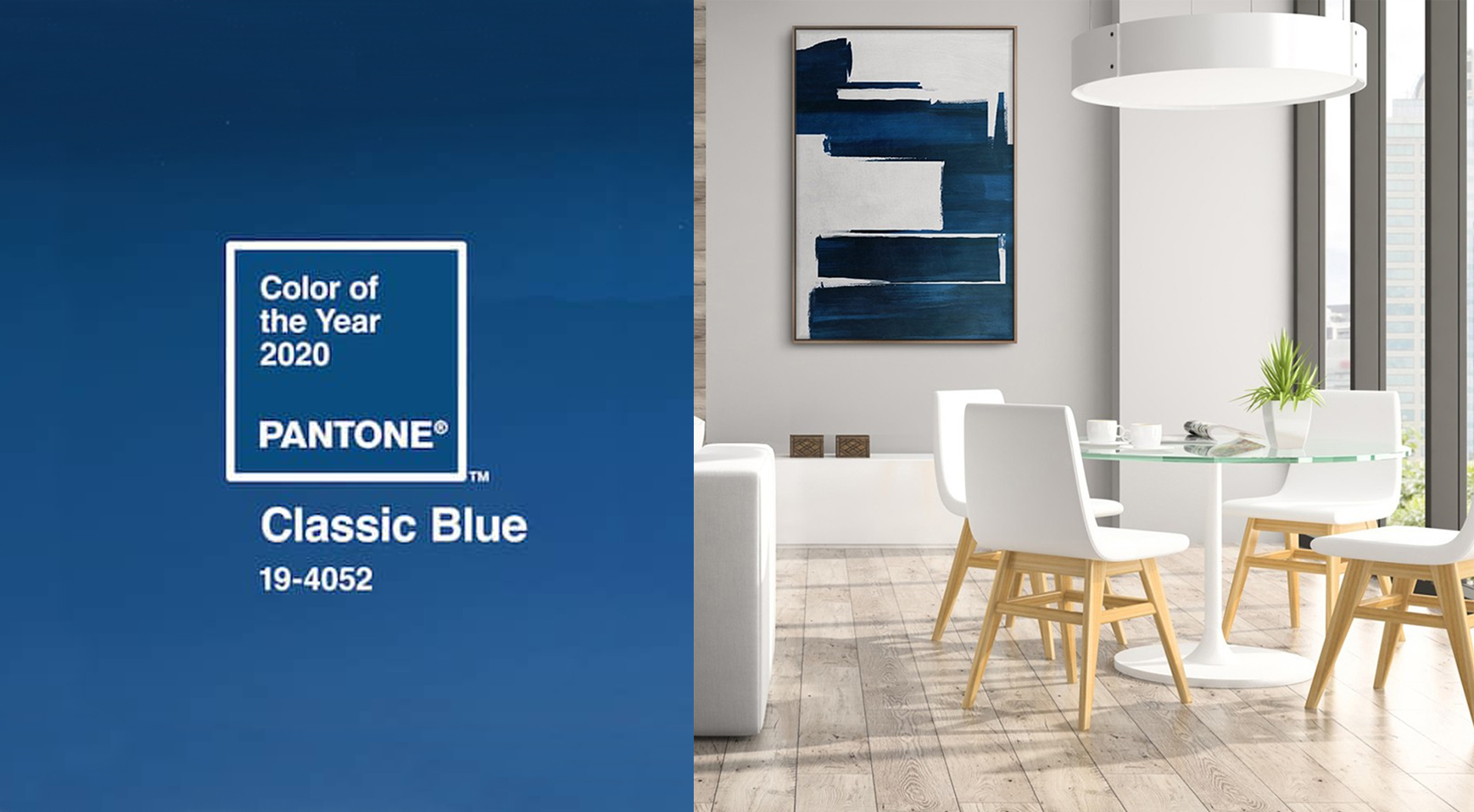
The Pantone company has designated the colour “Pantone 19-4052 Classic Blue” as the Colour of the Year 2020. Position in which it will replace the stormed “Living Coral” of 2019, and the tones “Ultra Violet” of 2018 and “Greenery” of 2017, as a reference colour in many creative fields such as fashion, interior design, graphic design and art in general.
PANTONE 19-4052 Classic Blue
Instilling calm, confidence, and connection, this enduring blue hue highlights our desire for a stable foundation on which to build as we cross the threshold into a new era. A timeless and enduring blue hue, PANTONE 19-4052 Classic Blue is elegant in its simplicity. Suggestive of the sky at dusk, the reassuring qualities of this thought-provoking colour drive people to rest and by its unbelievably de-stressing action. Classic Blue brings a sense of peace and tranquillity to the human spirit, offering refuge.
As technology continues to race ahead of the human ability to process it all, it is easy to understand why we gravitate to colours that are honest and offer the promise of protection. Non-aggressive and easily relatable, the trusted PANTONE 19-4052 Classic Blue lends itself to relaxed interaction. Associated with the return of another day, this universal favourite is comfortably embraced.
PANTONE Classic Blue takes the canvas
Art is an intemporal experience. An intimate experience that beautifies life in all expressions. Betting on that idea, PICTOCLUB stands up for democratization of bespoke & made-to-order art worldwide. This art studio has launched a wide range of original works in Classic Blue to enhance the beauty of hand-painted works.
From Spain to the world, the creative team of multidisciplinary artists that from part of PICTOCLUB offer a great variety of made-to-order & custom-made art in Classic Blue available online.
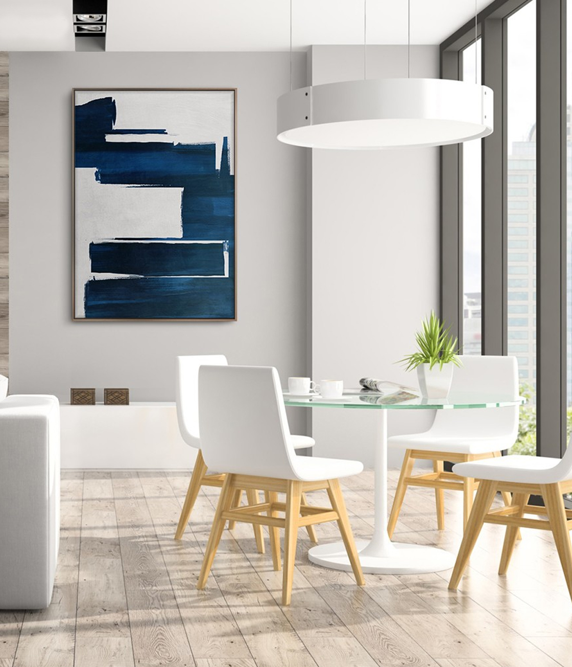
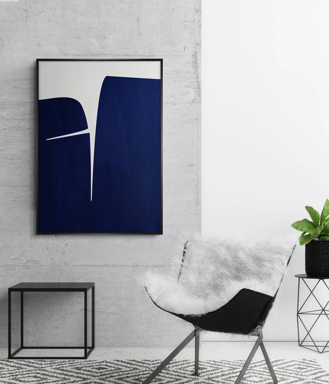
BLOCKS BLUE – PICTOCLUB Originals Collection
Acrylics on canvas – 90 x 120 cm – Natural wood frame
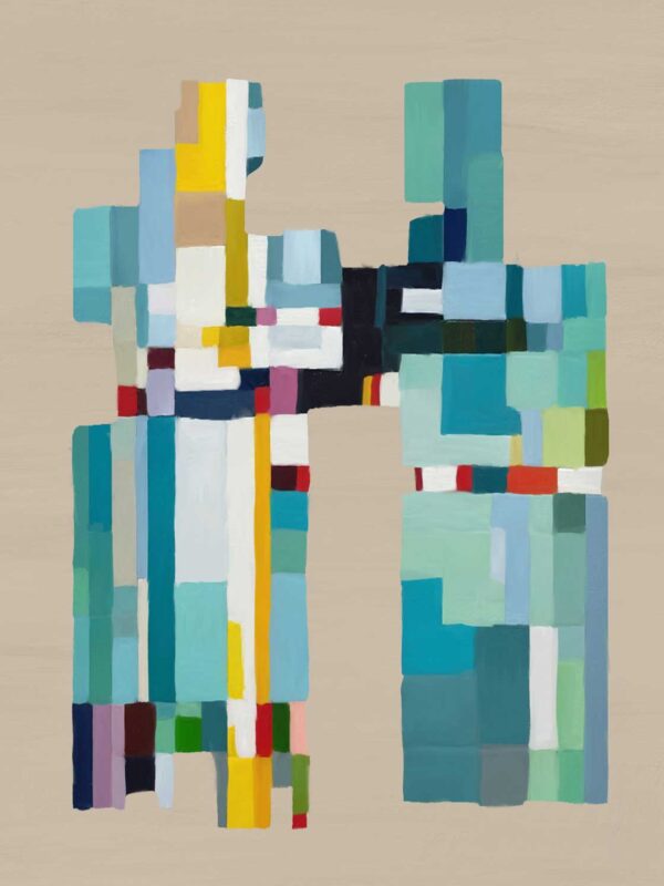
Classic blue brushstrokes acquire sole control over the white canvas in “Blocks Blue”. Juxtaposed traces in classic bluish hues against the infinity of inmaculate backdrop to catch the eye. This fine and elegant artwork belongs to PICTOCLUB Originals collection and its made-to-order in bespoke sized and frames here.
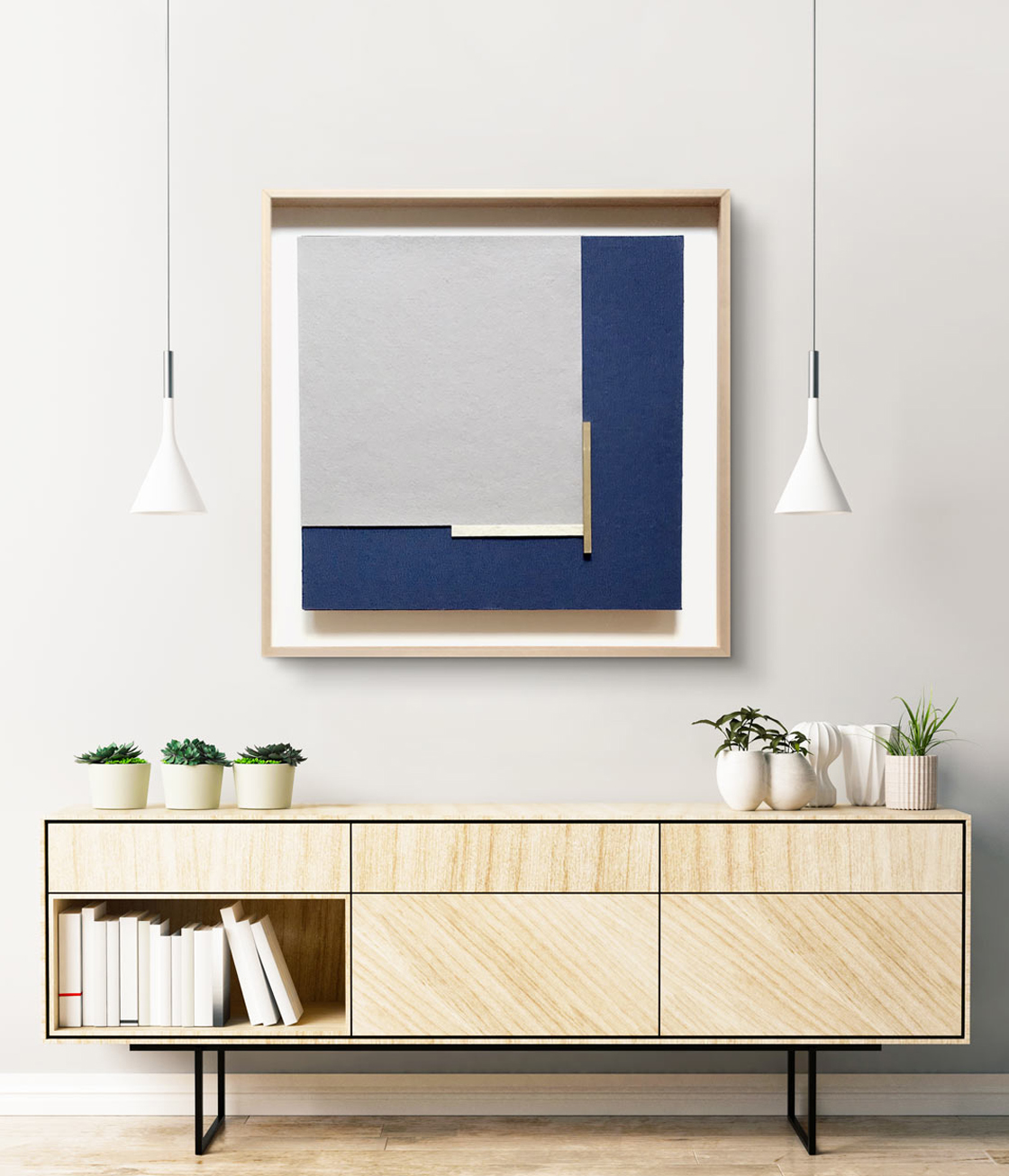
REGINA 4 – PICTOCLUB Artists Collection
Brass & fabric – 60 x 60 cm – Natural wood frame & museum glass
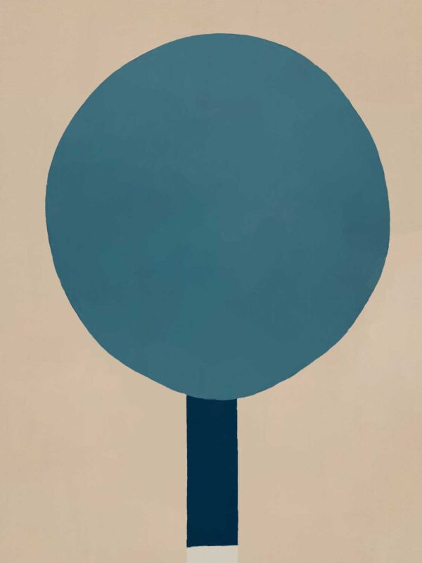
Two pieces of equal size but different material: textile and brass. Both framing an eye- catching grey figure in a subtle and elegant way conveying a huge sense of simplicity. Created mixing brass, industrial felt in natural colour, classic blue fabric and 100% organic wool felt in grey. Framed in natural beech wood with museum glass finishing and available online here.
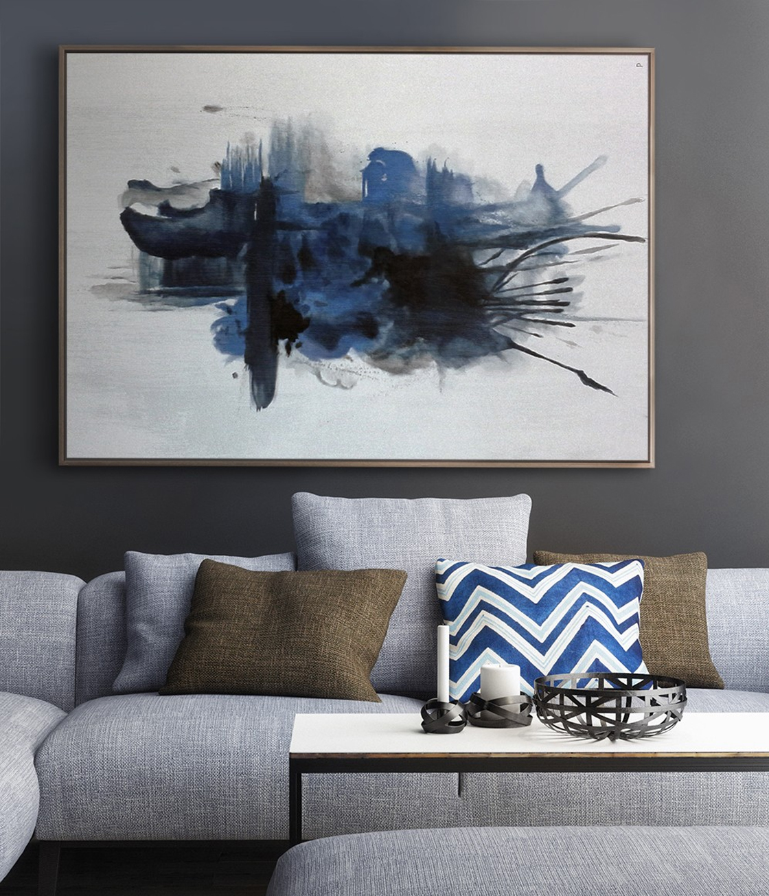
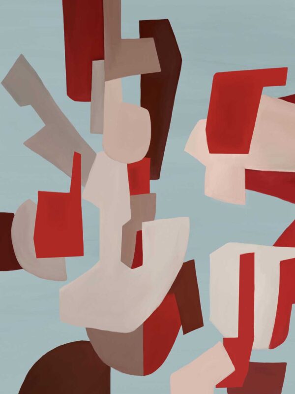
IMPLOSSION 2 – PICTOCLUB Originals Collection
Acrylics on canvas – 140 x 100 cm – Natural wood frame
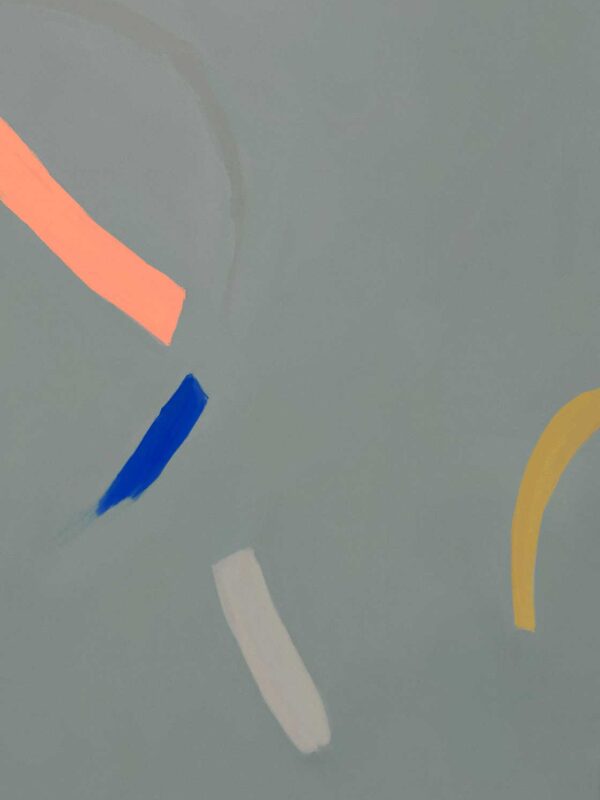
A mirage of classic blue collapse in and out the canvas once and once again. Messy elegance, dainty shapes evoke an intimate sense that becomes perfect for an office space or private quarter. Classic blue palette expressed into a liquid form creating a unique atmosphere. Buy it online here.
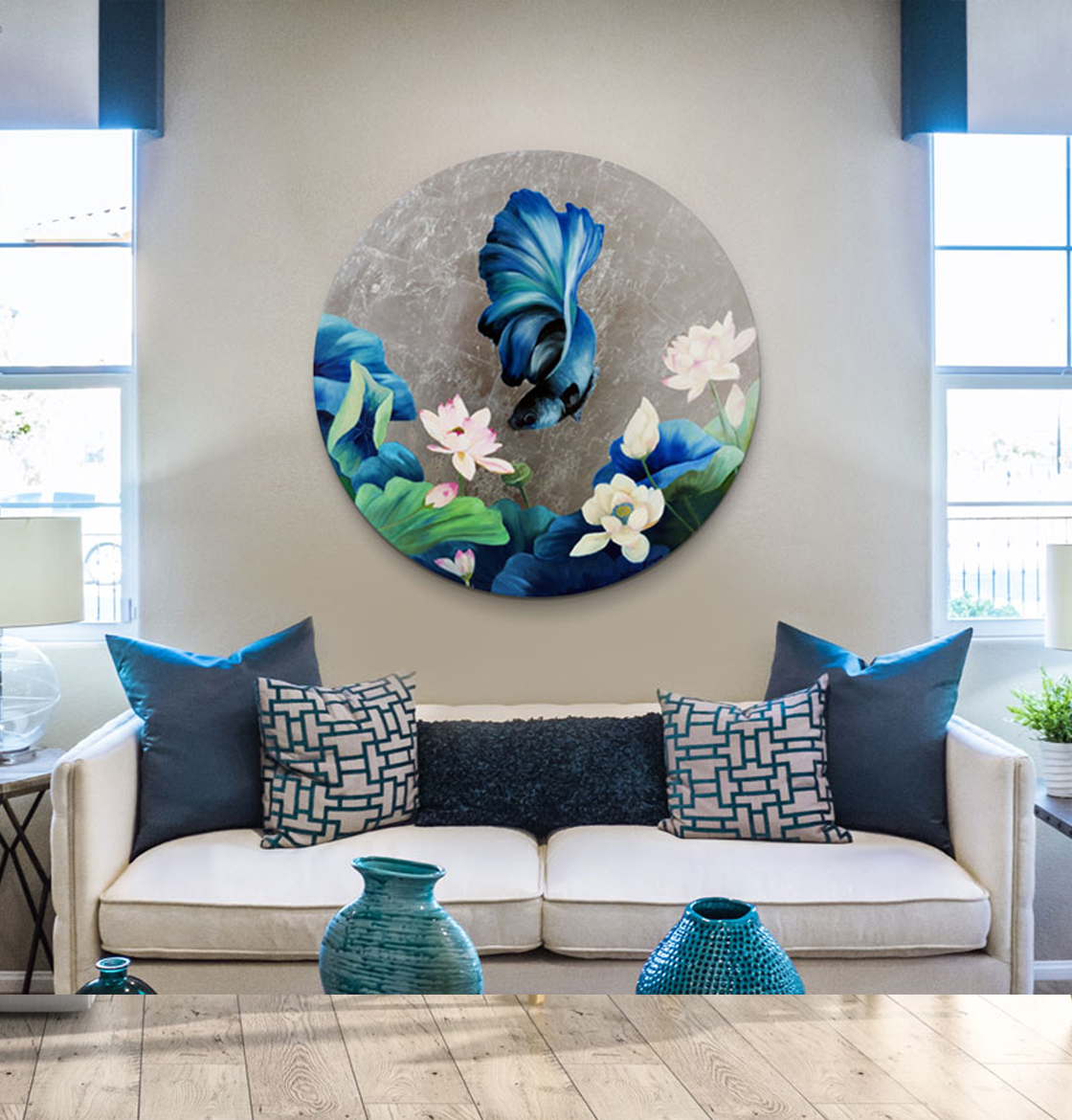
FIGHTER FISH – PICTOCLUB Artists Collection
Acrylics & silver leaf on canvas – 100 x 100 cm – Unframed
A blue fish meanders in a sea of water lilies and liquid silver. Fascinating work elaborated by hand using in oils and silver leaf on canvas. A classic blue palette adds an extra daintiness to a oriental influenced work hand-painted in acrylics. Eye-catching silver leaf applique. A unique artwork on sale here.
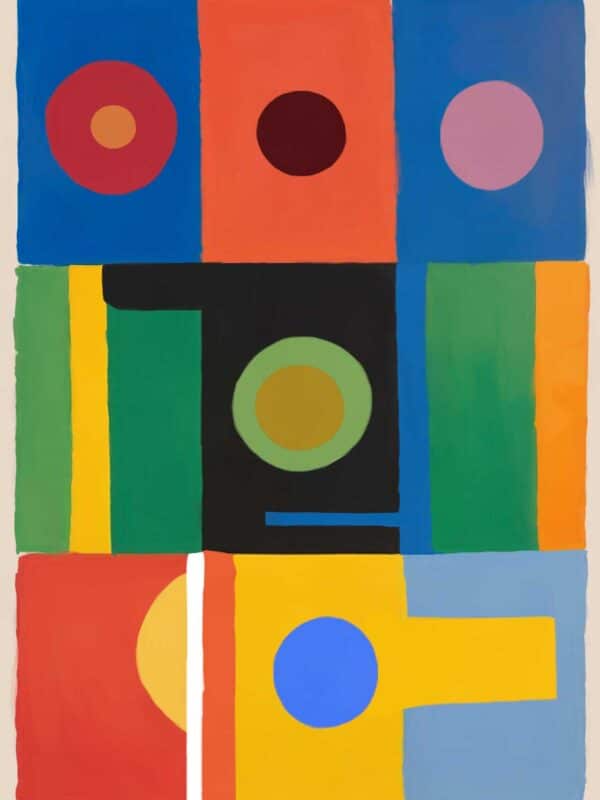
TIK TOK – IMPLOSSION 2 – PICTOCLUB Originals Collection
Acrylics on canvas – 140 x 100 cm – Natural wood frame
Add a minimalist bicolour painting to your interior. “Hero” is a great way to incorporate a touch of such a classic & elegant touch of colour as classic blue without renouncing to minimalism. Bold shapes that play within the space creating a sense of movement that will bring a touch of contemporaneity to your interior. Buy it here.
About Pantone Colour of the Year
For over 20 years, Pantone’s Colour of the Year has influenced product development and purchasing decisions in multiple industries, including fashion, home furnishings, and industrial design, as well as product packaging, graphic design & art.
The Pantone Colour of the Year selection process requires thoughtful consideration and trend analysis. To arrive at the selection each year, Pantone’s colour experts at the Pantone Colour Institute comb the world looking for new colour influences. This can include the entertainment industry and films in production, traveling art collections and new artists, fashion, all areas of design, popular travel destinations, as well as new lifestyles, playstyles, and socio-economic conditions. Influences may also stem from new technologies, materials, textures, and effects that impact colour, relevant social media platforms and even upcoming sporting events that capture worldwide attention.
DISCOVER GREAT ART TO BUY
PAINTINGS
PHOTOGRAPHS
SCULPTURES
BOOKS
